Stenciled Scotland Messenger Bag

Have you ever wanted to stencil the name of a country you’ve never been to onto a thrift store messenger bag? I certainly have. So I did.

image2

Sunday morning in nowhere-near-Scotland vibes.

Like so many of my projects, this one has a long and storied past, but I’ll try to keep it succinct. I’m half Scottish and decided I needed to make a Scotland sweatshirt (I guess I forgot that the internet exists so that we don’t live like pilgrims making all the clothes we desire). I painstakingly made a stencil and stenciled it onto a sweatshirt and, don’t you know, it looked great. Then I washed and shrunk the sweatshirt so it no longer fit me. It was fun while it lasted. But I hung onto the stencil for a long time, just waiting for the perfect item on which to try again to fall into my hands. And then I found this canvas messenger bag at a thrift store. And THEN a few years went by and here we are today.

image4

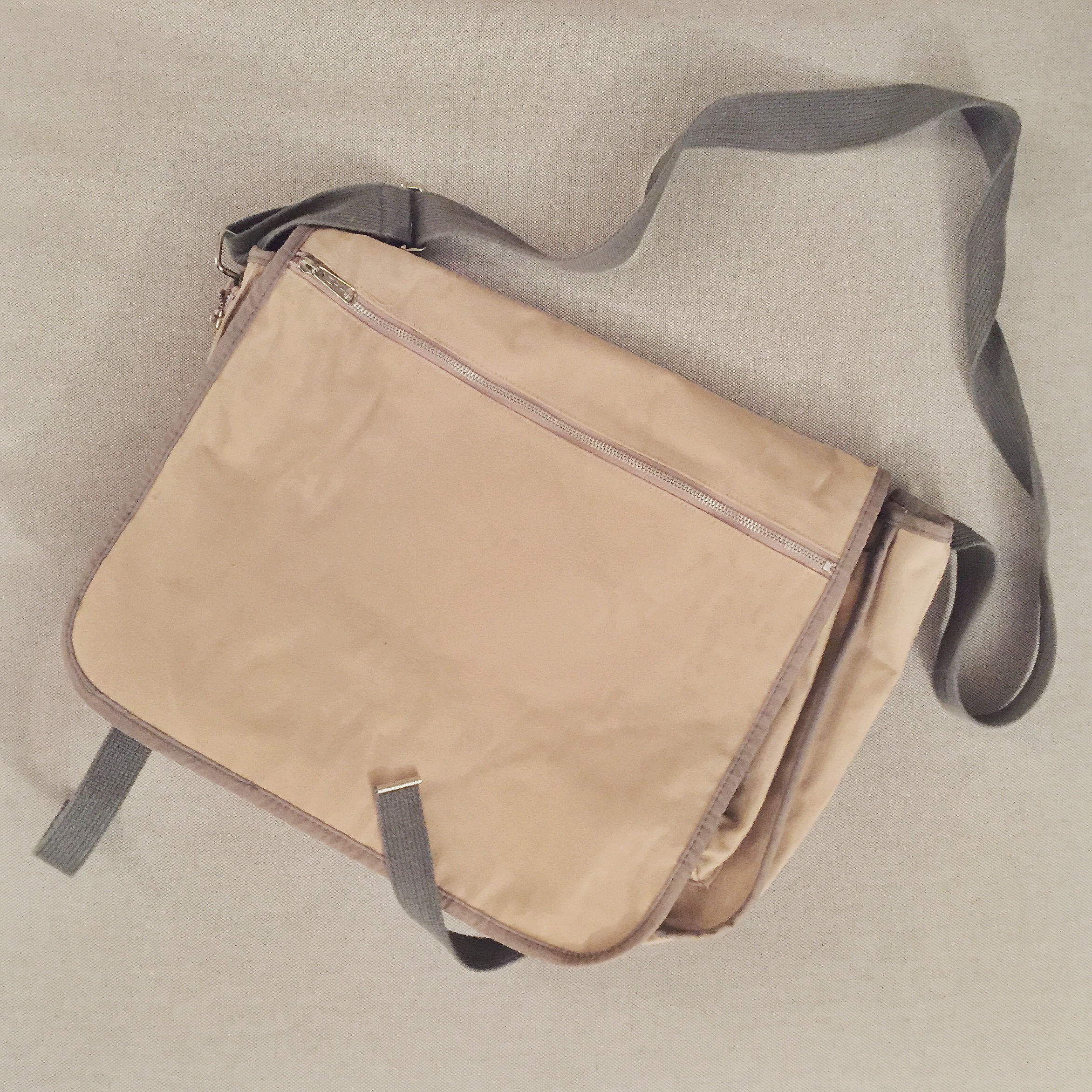
The blank canvas (bag), perfect for carrying around heather and haggis.

So that’s what I started with. Actually, I should back up. I started with a printout of a crest and the word “Scotland” in the font I wanted, a blank sheet of stencil material, and an Exacto knife. That’s how the stencil came to be. It took forever, by the way.

I measured where I wanted to put the stencil so it was centered on the front of the bag and pinned it there. A note about this: the first time I stenciled the sweatshirt, I used some sort of temporary spray adhesive that worked great and the stencil turned out perfectly. I couldn’t find it at the store this time and the guy recommended just using push pins. Needless to say, go with the spray if you can find it: way easier, less time-consuming, and better results. I am going to give that guy a piece of my mind if I ever see him again.

image6

Here are the two stencils pinned down with 8 million stick pins. The pins worked OK but were not ideal.

Once the stencils were pinned down, I used one of those cheap foam brushes to dab on the paint. I just mixed blue and black craft paints that I already had to make the navy color I was looking for. #resourceful. Unsurprisingly, the pins got in the way (and had to be tossed after), another reason the spray adhesive would have worked better.

image8

Painted but before the big reveal.

But it still turned out pretty well! The fact that the paint seeped under the stencil a little actually kind of gave it character and made it look not-so-perfect, in a good way (or so say I when I’m justifying why it’s not perfect). But, baby, it’s perfect to me.

image1

The finished product. Imagine me on the floor of the coffee shop taking these pictures to get the full visual.

The good news is that the design is actually legible, and I can reuse the stencil again and slap something on top of this if I decide that I hate it. But I think I like it. It’s growing on me! They may take my life, but they’ll never take my STENCILSSSS!

Slouchy Knit Hat with Pink Accents (and a Pom-Pom!)

image1

Photo cred: my sister Ellen. Awkward facial expression cred: me.

Where do I submit my hat for the fastest-project-ever-completed award? As opposed to the pillow that never seemed to end, I did this one from start to finish in under a week. I think it only took about three total nights of sitting down to knit for an hour or two to finish it—a refreshing change!

image3

Tan and bright pink—who knew?!

This was a fun, super-easy pattern (that I found on Ravelry) to knit that started on circular needles and then switched to double-pointed needles. I must brag that the pom-pom was not part of the pattern—that was all me, baby! As usual, I didn’t check the gauge and winged it with the yarns that I used (both of which I already had lying around) but it worked out. The thick tan yarn (Patons Classic Wool Roving in Natural) and the bright pink yarn (a cotton yarn I had from a dishcloth I made awhile back when that seemed like a fun idea) turned out looking pretty good together. The whole hat required less than one skein of the main tan color and hardly any of the accent color (perfect for using up leftovers). I definitely want to make more of this hat and I especially like the pop of bright color in the purled rows.

image4

That pom-pom tho…

My stock of yarn is making me question one thing, though. Am I so boring that my favorite color might actually be tan or gray? I don’t think so but, man, for everything I knit, I’m drawn to using shades of grays, browns, and neutrals. Oh well. Maybe I’ll make a neon green turban next.

image2

The perfect chunky hat for a snowy day.

A Knitted Union Jack Pillow

image2-19

That’s right—I’m not burying the lead. Here’s the finished product before I even say a word. #generous

Good gravy, it’s been ages since I’ve posted! Which is about how long it’s taken me to knit this pillow. Seriously, I started it at least a year ago and while, of course, I wasn’t working on it constantly, it was really putzy. It didn’t help that I had to start over twice (during which time I learned a new word and a new knitting technique called intarsia) and that the needles required for this were approximately the same circumference as toothpicks. But I did it! I’m finished! And no, I will not make one for you! Sorry. But just no.

image3-13

Aw, it’s already fitting in and getting along with my other pillows!

Even though the pillow is way bigger than I was expecting, I love how it turned out. I especially love the colors because they’re muted and go with almost anything. My apartment is starting to go a bit England crazy, so this is one relatively subtle addition to the decor. I used this pattern from Ravelry which, once I figured out what intarsia was and how to do it (look it up), was pretty easy to follow and execute—just time consuming.

image5-9

Close up of the colors (there are actually 2 slightly different dark browns that I used) and the INTARSIA I finally mastered.

image4-12

The finishing detail—buttons to close the opening in the back. I now see that the ribbing doesn’t line up 100% but screw it; it’s on the back anyways.

Now that I’ve finally finished my epic knitting project, I am jazzed about it again and excited to start knitting something else. I’m thinking this hat will be up next. Stay tuned, little turkeys. Yah? yah. #MakingAMurderer

image6-6

My picture-perfect apartment. Just kidding. I moved about 10 pounds of crap off the couch to take this picture and there are dead leaves all over the floor to the right. Oh well.

Gallery Wall

It’s been far too long since I posted—apologies to my follower. But now that summer/an active lifestyle is done, I am excited to get back to it! To get into the groove, I’d like to share something I’ve been wanting to post: my gallery wall. I’ve been a fan of this type of setup for awhile and have read (and ignored) lots of tips on how to create your own. And now I’m about to give you tips on how I made mine, so take that with a grain of salt.

My humble gallery wall.

My humble gallery wall.

Please note that I did not intend this to be a shrine to my own artwork but when you’re a. into painting and b. too poor for real art, it happens. Deal with it. I thought I’d mention where the pieces came from and point out some of the vintage or thirty ones BECAUSE IT’S WHAT I DO!

Ms. Foxy: Hardcore fans of my blog (JK, that’s not a thing) will recognize this as a painting I did in my last art class. End of story.

The Golden “B”: The newest addition to the wall! The letter was a few dollars at Target and I spray painted it gold and drilled a hole in the back to hang it. So easy and cheap!

Whale Cribbage Board: A favorite of mine from a local vintage store.

My Passport: Six pages of my passport, separated and framed with a custom-cut mat. Hint: if the coolest stamps are on back-to-back pages, a color copy looks just as good.

My Dad’s Army Photo: My favorite picture of him, because I think he looks like a movie star.

Gold Framed Oil Painting: An original painting of Paris that I got at my favorite antique store by my cabin. Super inexpensive for an original anything.

Mask: A tiny little mask I picked up while volunteering in El Salvador that cost a couple bucks.

Dog painting: My beloved dog Bailey, painted by me.

White Framed Watercolor: This is a painting of the Mirabell Gardens in Salzburg, Austria that I bought from a street artist in the same location.

Eiffel Tower Painting: Another one I did in art class. This one is a copy of another painting.

Wooden Framed Mountain Painting: A painting I did from life (is a mountain alive?) while in Seward, Alaska at a plein air painting weekend.

Silver Framed Boat Painting: Another from the same Seward plein air weekend with a frame from a thrift store.

Vintage Book: A vintage book made into a clock that I bought at a flea market in Brooklyn.

My Humble Advice and Tips:

  1. Mix and match everything. Gold and silver. Black and brown. Homemade and purchased. Photos and other media. Some people go with all photos or all black frames which can look really great, but I love the unmatched look of my wall (and I think it fits my apartment).
  2. Don’t think you have to spend a lot. The most I spent on anything on this wall was probably getting the custom mat for my passport, which was not all that much. Homemade art can look really nice!
  3. Include three-dimensional stuff along with two-dimensional art. It really adds another, well, dimension to the wall. Consider hanging things that aren’t normally meant to be hung. I had to nail a wire to the cribbage board to hang it up, but it’s one of my favorite parts of the wall (and since I don’t know how to play cribbage, no big loss).
  4. Search thrift stores for picture frames. Those can often be the most expensive part, but places like Goodwill are overflowing with them for cheap.

A Pink and Gold Vintage Cocktail Party

It all started with a Facebook article about the lost art of the cocktail party. So I decided to bring it back. And basically start a revolution. Definitely not just and excuse to dress up and have cocktails.

If you’re thinking these pictures look a lot better and more flattering than the normal crappy iPhone ones, you’re correct! One of my best friends and party guests just so happens to be a talented photographer and designer, too! Check out her company, Clark Creative! It’s awesome.

So without further ado, my first annual hello to summer cocktail party.

On my bar cart below, the decanters, pitcher, sign, lamp, and jigger are all antique/vintage. I used a lot of pink and gold candies to decorate for the party. It was an inexpensive and edible way to carry the theme all over my apartment. Plus, it looked pretty!

bridget-cocktail-party-001

Here’s a glimpse of my bar cart, actually made functional for once!

The other main piece I used to establish the theme colors were flowers and vases. Again, it’s an inexpensive, pretty way to add color and life to the party. I spray painted four thrift store vases in different shapes, patterns, and heights gold to make a mismatched set go together but still be unique.

bridget-cocktail-party-002

Some of the details on my bar cart. Can you tell I love gold?

bridget-cocktail-party-008

I’m just so passionate about my bar cart, I had to get a sign to announce it!

Here’s the thrift store tray I spray painted gold and recently blogged about (here if you missed it). Since I’m short on extra space and table room, I made a makeshift mixer table by setting the tray up on a chair. The cocktail tools are vintage.

bridget-cocktail-party-003

Does the tray look familiar?

I think the candy (or gum balls in this case) in martini glasses really makes for a fancy decoration! I’ll definitely use this trick for my next party. (Plus, I get to eat the leftovers!) Paired with another gold vase with pink flowers, the color scheme spreads to all corners of the room.

bridget-cocktail-party-006

Pink and gold all over the place.

Pretty cupcakes are another thing that can be used as a decoration and a snack. I made these strawberry lemonade cupcakes with lemon cake, strawberry frosting (piped on with a cookie decorating set), and a lemon drop on top, just in case you don’t get the clever theme. Also…they’re pink and yellow which is so close to pink and gold!

bridget-cocktail-party-004

It’s not every day I get to break out the tiered serving tray! In fact, it’s been two days, ever.

Now for what’s really important—cocktails! This drink was a hit! Of course I wanted something pink so I decided to make a champagne cocktail. I blended a few different recipes to make my own. I used champagne, strawberry kiwi juice, strawberry vodka, and strawberries to make a lovely, bubbly, pink concoction. It was a hit, if I do say so myself. And of course, another gold vase with pink flowers and the champagne glasses that I decorated with gold paint.

bridget-cocktail-party-013

Cheers!

Nothing on this cheese platter is pink or gold (well, that sausage might be considered pink), but it just looks so darn delicious. While fancy cheeses are pricey, this is a party located in Wisconsin, so it’s always worth it.

bridget-cocktail-party-018

What a dream come true. Just me?

And here’s a look at my apartment living room, all ready for a party! I can’t decide if leaving the lights up year-round is trashy, but I just love the soft light they gave to my cocktail party (and I’m obviously too lazy to take them down at this point).

bridget-cocktail-party-007

Home sweet home. But 100x cleaner than normal.

And I couldn’t resist including this one because I have to show off the outfit I wore! This is a cream vintage dress with orange polka dots that I picked up in Alaska. I also got a chance to pull out the pearls, which is rare. So that’s my party. Now, please, leave me alone so I can sit here staring out the window, drinking champagne in high heels, like I always do.

bridget-cocktail-party-016

Standard Wednesday.

Pallet and Scrap Wood DIY End Table

I think this is the project I have been most excited about so far! I was cautiously optimistic about how it would turn out, but everyone I told was pessimistic enough to bring me down to earth. Pinterest pallet projects are trendy lately, so there were many examples out there so I could get a good idea of what I wanted to make. However, I didn’t follow any directions*.

*Having a super handy dad to guide you and try to take over the project helps get around this obstacle.

And so here is my Memorial Day cabin weekend project, finally done! This is the before picture. I started with a couple normal pallets and some scrap wood—2x4s and 2x2s. Step one: we pulled a few of the wider, less junky boards off the pallets.

image1-13

If you have a dream in your heart and let your imagination run wild, you, too, can see a beautiful table in this old pallet.

Then, I cut the leg and brace pieces to size. These were cut from the scrap wood because the pallet wood didn’t seem strong enough to serve as the support pieces. To decide what height I wanted, I measured an existing end table. Dad pro tip: measure each piece individually and cut before measuring the next one. Also make sure to cut on the same side of the line you mark each time. After this, I screwed the leg and brace pieces together to form the base.

image2-7

Craft projects AND power tools? It’s true, I am the total package. Shout out to my assistant, Doug.

Next, we cut the top (I had to pull the tools out of Dad’s hand to give myself a turn) pieces from the pallet wood and drilled holes in them so they align with the wooden supports they’ll sit on top of.

image5-4

Geez, give someone else a turn with the drill DAD.

Next, I screwed the top pieces onto the framework. Hey, it’s starting to look like a table (if you flip your computer upside down)!

image1-14

Yessir, the table has a top!

Then, since things were going so well, we got fancy and added a fetching little shelf, just for fun. This wood was cut from the pallet too, but from narrower pieces. The width didn’t exactly add up to the width of the shelf, so I left a little gap in between each slat.

image2-8

Top and shelf in place…almost.

Then comes a task I truly abhor: sanding. Oddly enough, the electric sander made a giant difference compared to the grating task of sanding by hand for hours. The fact that I decided this table is meant to be rustic and slightly imperfect helped, too. Tip from me to you: if you state that your intended product is a rustic and imperfect one, you will be very likely to get those results and be less stressed along the way.

image3-4

Vroom, vroom! (Electric sanding noise.)

Look at that. Smoooooth like butter. You could rub your powder soft cheeks on it, (does she mean face or butt? I’ll never tell) but I don’t necessarily recommend you try. The table is all constructed already! Wasn’t that fast? Now comes the really exciting part: turning it upside down yet again! Hold onto your hats!

image4-5

Here it is, all constructed!

But really, this is actually the exciting part. Staining the table really starts to give an idea of what it’s going to look like when it’s finished. The stain was another leftover freebie that my parents had from somewhere.

image1-15

Oops, there’s a stain on my table. [Pause for laughter]. Coat #1 done.

As much as my dad stood watching and endlessly critiquing me while applying a second coat of stain disapprovingly, I went for it. And I love the final color. The darker wood is definitely my style and will fit with my apartment’s decor, too.

image2-9

Coat #2 complete.

And now for the fun, endless part: sealing. I ended up doing one coat on the entire thing, a second coat on all the visible outer pieces, and a bunch more on the top and the shelf, probably six coats total. The idea of the seal was to fill in as many of the rough and uneven areas as possible. Plus, it gives it a shiny, smooth look.

image3-5

Seal the deal.

So, without further ado (this got entirely too long but I am just so excited), here’s the final product!

image4-6

No, of course I did not stage this picture. I always read Emily Post by the dim light of my antique lamp.


image1-16

It fits perfectly in the spot I wanted to use it!

Oh, just one more picture, why not?

image2-10

Me so shiny.

As an added bonus, this entire thing cost nothing! I got the pallets donated by a friend and everything else was leftover from my parents or lying around the cabin. So I finally did it. My big pallet project. Whew 🙂

Urban Gardening

That’s right folks—my green thumb is back! What that means is I’ve purchased pre-grown plants from the store and have made a commitment to them, myself, and all of you to try to keep them alive for a while. The weird thing about doing gardening as simple as replanting when you live in an apartment building is that you don’t really have access to dirt. So I took a mixing bowl and, under the cover of night, snuck a few scoops from the front “yard” (about five square feet of grass) of my complex. Don’t tell my landlord.

image1-11

I got the idea on Pinterest to reuse tea tins as planters. And since I had a few English teas in cute tins lying around, I bought a couple of ADORABLE and tiny succulents to fill them! Plus, I, of course, love the British decoration of the tins. Here are two succulents sharing a home in a double-decker bus tea tin. (I’m hoping the sparse one recovers after being dropped on its head.)

image6-2   And here’s a solo plant in an English breakfast tea tin.

image3-2There have got to be tons more things you can do with these tins, but I haven’t come up with any other ideas yet. Anyone have some? Just in case, I better keep drinking tea.

A Foxy Gentleman

Project number two from this session of art class is a painting of a lovely gentleman (I think) fox. I originally thought it was a female and my art teacher didn’t, but I just couldn’t bring myself to paint boobs to make it true. I was inspired by (copied) this painting I found on Etsy via Pinterest. I’ve been very into foxes lately so one wearing a British riding coat seems fitting. It only took about two classes to finish up. I think it turned out pretty well! image1   I like how the plain, really light peachy background sets off the fox and makes it look more like a fancy portrait. My teacher wanted me to change it and add more color, but I stood my ground. Here he is resting on my green leather chair, as fox oil paintings are wont to do. I’ve still got to find a good spot for him/her but I think it would fit in nicely in my chair and book corner. image3The next painting I’m working on is of a rug! I hope it turns out better than it sounds in that sentence.

Spray Paint is Magic, Part Deux: The Golden Edition

I’m not saying I’m a gold digger, but I’m really digging everything gold lately. And, if you saw my other spray paint project, I really dig spray painting things, too. It’s cheap, easy, and completely changes an item into something else. So you can see where this is going: gold spray paint! I’ve also been into trays like everyone else so when I found this metal one at Goodwill, I snagged it up. image1-4 Once I had the gold spray paint in my grubby little hands, I couldn’t fathom just spray painting one item in my apartment, so I settled on an amount between one and everything I own (everything was tempting but I chose two). That’s how this boring pencil holder got roped into the deal. Sucker. image1-5 If you haven’t looked at metallic spray paints lately, there are a lot of options. They range from insanely shiny and reflective to toned down and matte. I picked one on the matte side in a gold tone. I first washed the tray and pencil holder and then sprayed them with a coat of primer. I wasn’t sure if the paint would stick to the shiny surface of the tray without it. Then it was just three-ish coats of the paint and here’s how they turned out! image2-5 image3 As you can see, the only thing that didn’t work out is that you can still slightly see the logo on the tray. I’m debating whether I will try spraying a bunch more coats to cover it up or try mod podging something onto it to cover it up. Otherwise, I love the color and the finish. And in the meantime, once the tray is styled, the writing doesn’t really show at all. See?! image4-2Cost of the project:

  • Tray: $3.99 at Goodwill
  • Gold spray paint (Valspar quick-drying metallic): $3.14
  • Primer: already had (ha! I WIN!)

image1-9

A Bicycle Dress Built By One

Another day, another dress! After the first dress I sewed went so swimmingly, I decided to make another while the motivation was still fresh. And, like the first one, it only took about a day to make! And since I could reuse the pattern, the total cost for the dress was even less.

IMG_3729

I used New Look pattern 6587 again. It’s a really great pattern in that it’s easy, fits me well, and has enough variations in the sleeves and other options that I can make multiple dresses that don’t feel or look the same. I fell in love with this springy bicycle pattern when I was hunting for fabric for the first dress and had to go back for it (and I’m glad I did). Since I needed under 3 yards of fabric and buttons were the only other expense, the dress was only about $20 from start to finish.

Everyone I’ve shown has loved the red buttons and I have to admit those are my favorite part too! They are a fun detail that add some color to the white dress (and make the pattern pop, too). The sash adds something unique as well and can easily be swapped out for a belt.

IMG_3730

I felt confident enough to make a few adjustments to the pattern this time around. I didn’t add interfacing to the collar so that it would be smaller and less stiff. I made the collar smaller overall and I like the less-prominent collar on this dress much better. I also took the bodice seams in a little bit to get a more fitted look. It worked out really well but if you’re trying it, remember to start with a tiny bit—you an always take in more but it’s harder to let it out!

Here’s the finished product. Now I just need spring to come! And maybe like, 4 more dresses.
IMG_3728